Colours Matter
I like these print ads from Optagraf, a Portuguese printing company. They could have done a bit more with them, or more of them, but I love the style and the idea.


I like these print ads from Optagraf, a Portuguese printing company. They could have done a bit more with them, or more of them, but I love the style and the idea.
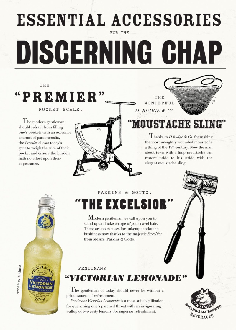
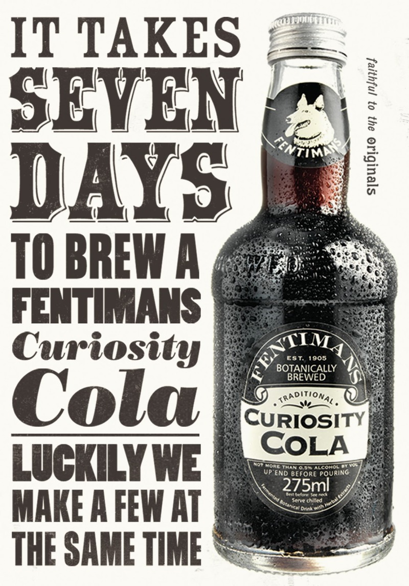
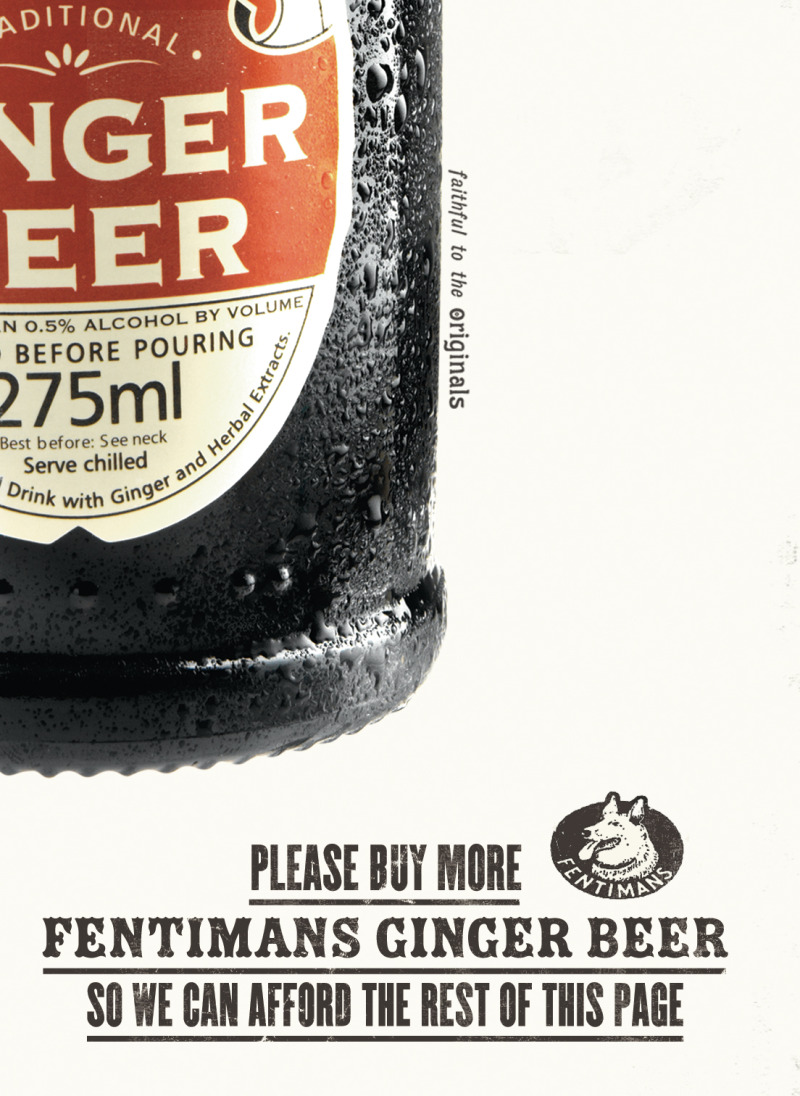
We had cases and cases of Fentimans at our wedding in July. We wanted some fizzy drink, and wanted something that would go well with our red and white striped straws (we were very particular). After going through about a dozen various old fashioned bottles of cola, lemonade and ginger beer, we happened upon Fentimans, which not only looks gorgeous, but also tastes bloody lovely (they also made dandelion and burdock which was really the icing on the cake). Anyway, today I read a post on the Sell! Sell! blog and it turns out they do Fentimans' marketing, and rather lovely it is too. Here are some prints.
This year, 2011, is the International Year of Chemistry. I like stuff like that, so you can imagine how excited I was when I came across Simon C Page's posters. I bought one. It's beautiful.
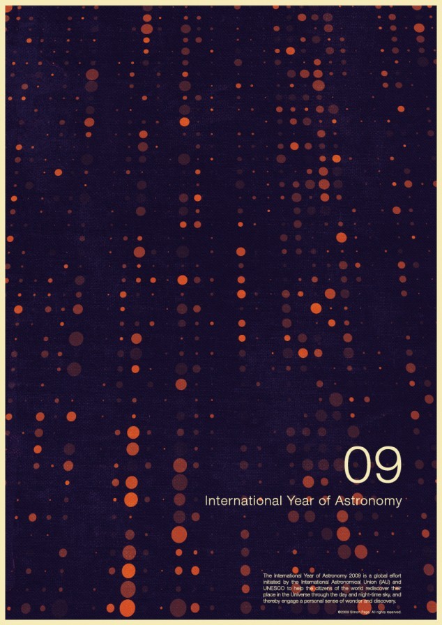
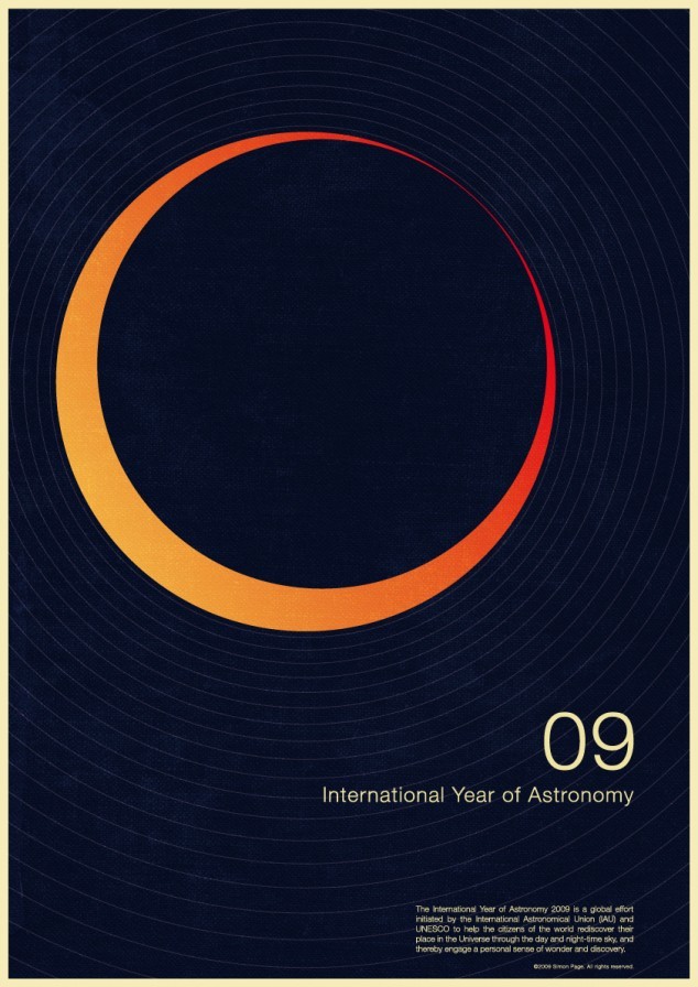
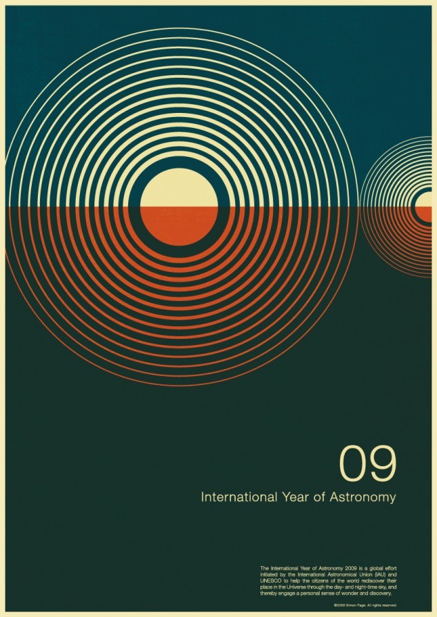
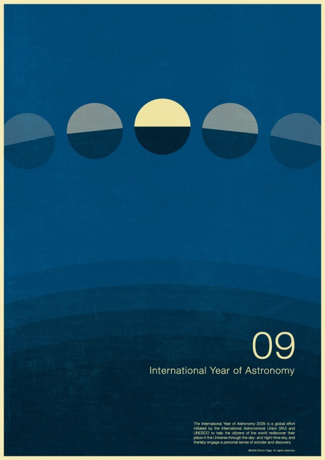
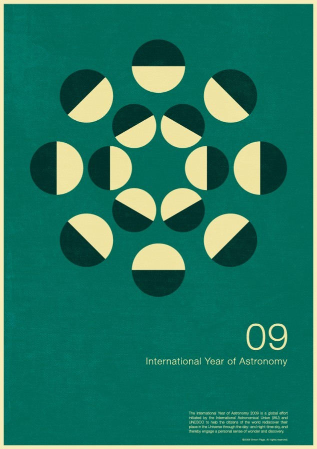
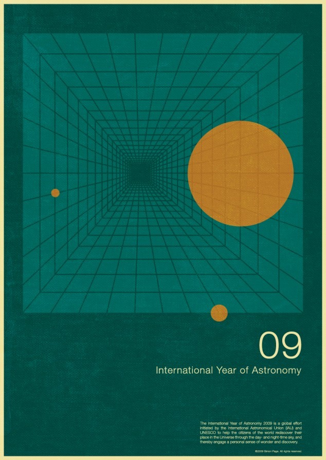
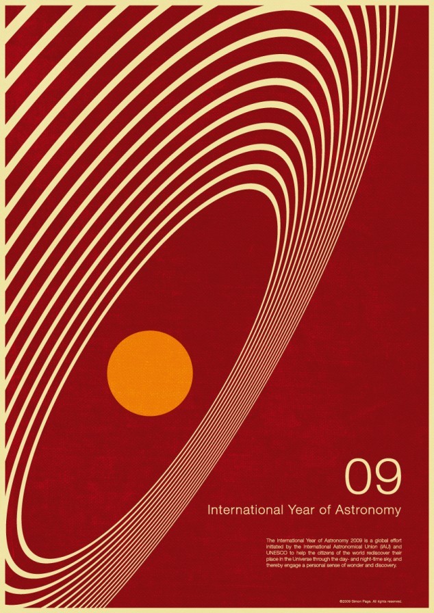
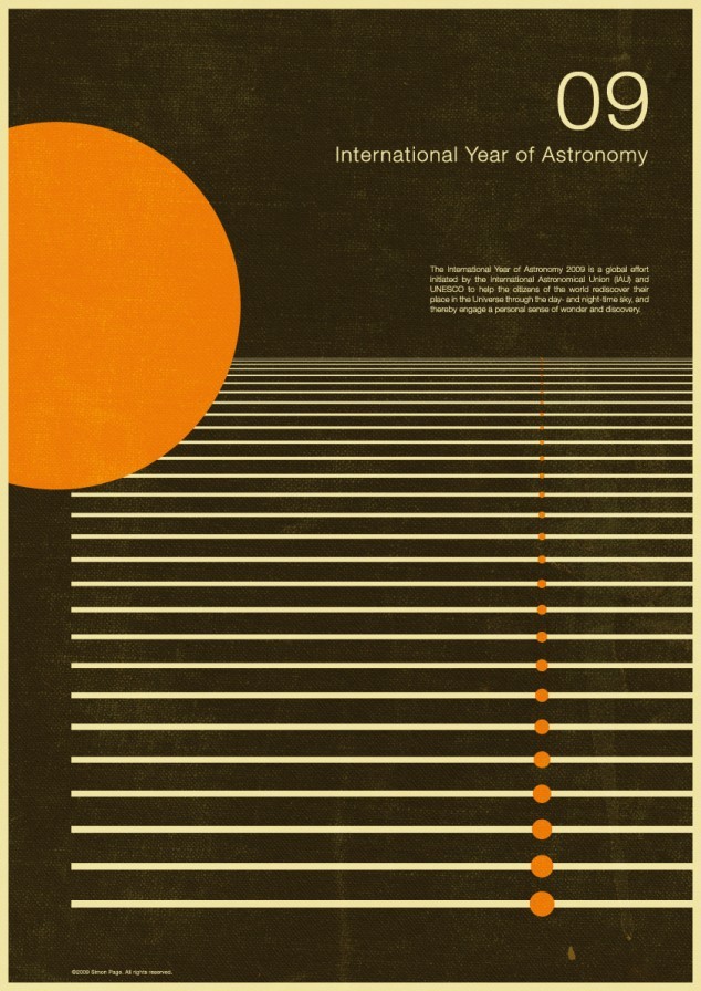
Today, I stumbled upon more of Simon's posters, this time for the International Year of Astonomy, and they are just as beautiful. As with the chemistry posters, these are also available for purchase (the wife will kill me). I hope he's OK with me plastering my blog with his work.